Project Summary
Objective: During my internship with AJi Software (now Squared Digital), I assisted in the creation of a content management system that fostered communication between teachers, administrators, and parents for a local elementary school. I also assisted in the redesign of a major hospital’s website. My general duties were collaborating with developers, designing interactive prototypes through an iterative process using an Agile approach, and assisting in composing articles for the AJi blog.
Innovation: We designed a portal which provided teachers and administrators the ability to send notification, create games, and create events from one centralized location. We also allowed users to access these functions throughout the portal without the need to navigate back to the main screen. Note: The hospital wireframes could not be shown due to confidentiality.
Work performed: User research, Usability testing, Mockups/wireframes, Prototyping, Data collection/analysis, Presentation.
Objective
While working as an intern at Alexander and Julian Incorporated (now Squared Digital) we were tasked with creating a software platform that would allow teachers and administrators from Manchester Park Elementary to more efficiently communicate with their students’ parents, address needs, and provide an educational way for parents to take an active role in their children’s academic development.
At the time Manchester Park Elementary was sending flyers home with their students to give to their parents about upcoming events and activities. This was not an effective strategy as many times the information would get lost or not get to the parents in time.
Our users expressed the need for a solution that would allow them to perform multiple functions within the same screen for quick access, and with little training requirements. These functions included sending notifications to parents, managing staff/student rosters, tracking daily activities, and create and send educational games to the parents’ registered smart devices.
Personas
Upon speaking to the clients we identified two main personas; teachers and administrators.
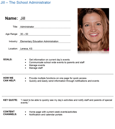
Administrator Persona
Administrators wanted to be able to communicate with parents and staff, track daily activities, manage teacher and student rosters, and manage what information teachers displayed on their activity pages.
Teacher Persona
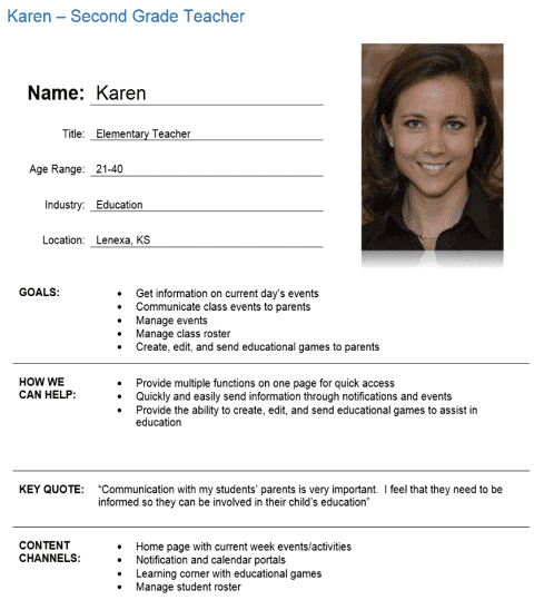
Teachers wanted to be able to communicate directly to parents, track daily activities, send and monitor educational games to parents, and manage student rosters.
Major Pages
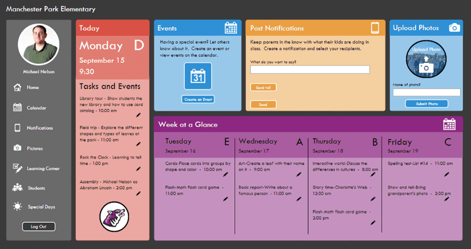
Dashboard
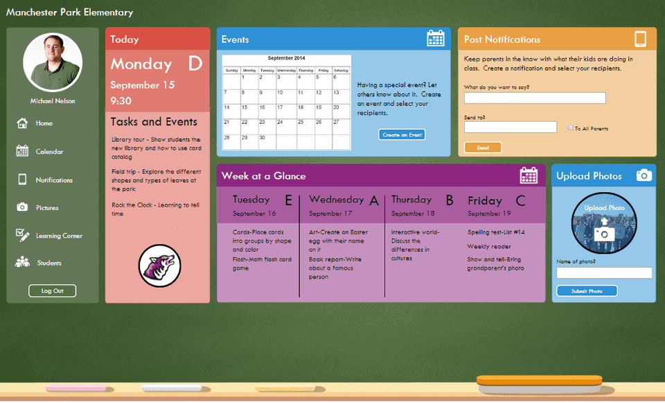
At that time both teachers and administrators were using software that resembled Google Docs. In ordered to decrease training requirements we created a content management system which used a card layout which resembled Google Docs.
Each card presented its own unique function, and users could access and edit all of the information in them directly from the dashboard.

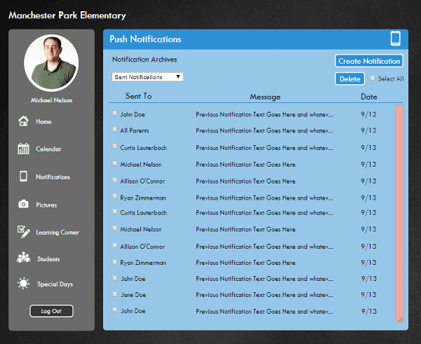
Push Notifications
Users had the ability to send emails to specific parents or to all the parents within their class, and manage them for later reference.
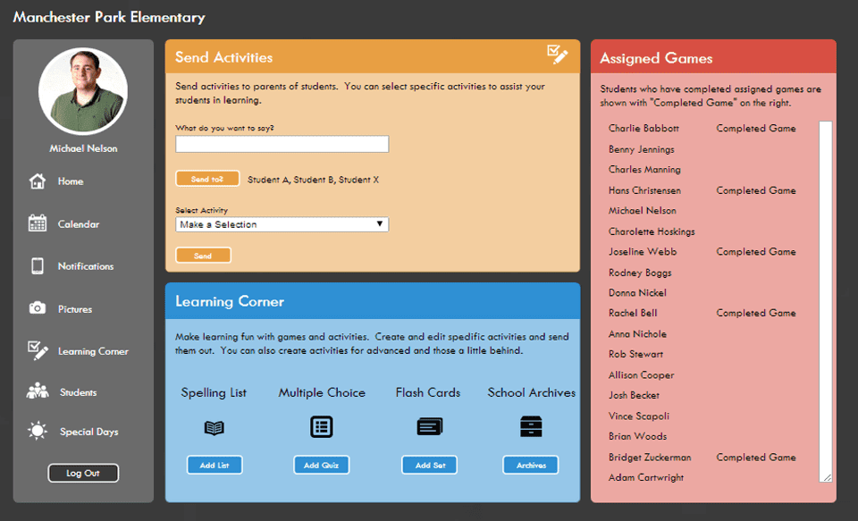
Learning Corner
Parents were consistently asking both administrators and teachers how they could play a more active role in their child’s education.
Our learning corner allowed teachers to create educational games based on the information they were being taught in class and send them to individual students (allowed for extra easy or hard levels based on the child’s progress) or all the parents in the class. Teachers could even receive a date stamp of when the game was completed and score in an attempt to monitor progress.
Iteration Process
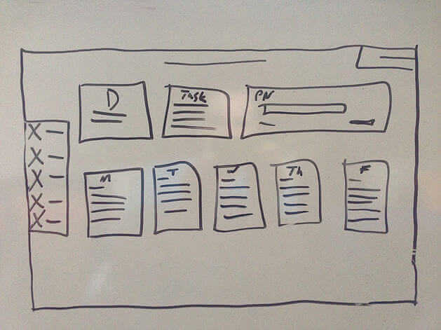
Initial Concept
Our design took the shape of a content management system that was similar to Google Docs by using a card layout. A card layout increased familiarity, decreased training time, and increased efficiency.
Each card presents its own unique functions, and when clicked opens across the whole screen while leaving a static side navigation menu.
Finalized Concept
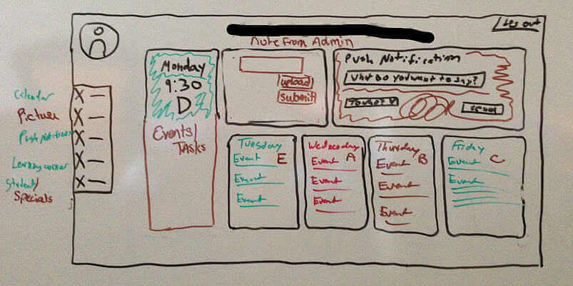
Our final concept incorporated the ability to edit information directly from the dashboard, and allows users to display a profile picture for personalization.
First Iteration
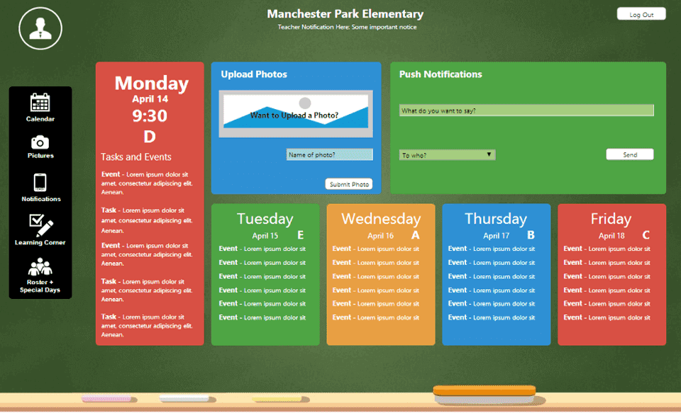
We used color to add distinction between cards and a chalkboard background to give it a scholastic appearance.
Second Iteration
Users expressed a need for a more streamlined navigation, be able to differentiate between headers and editable information, and add graphics to attract attention and differentiate each card.
Final Iteration
Finally, we removed the chalkboard background in favor of a black background for more saliency, and to decrease clutter by increasing the size of each card on the dashboard for better clarity and interaction.
