Project Summary
Objective: We were asked to evaluate and provide designs to the IowaWorks service which provides information about jobs, resumes, testing, and other resources to Iowa job seekers either on a website or kiosk.
Innovation: We traveled to Iowa and used the website in its natural environment. After the interaction, we designed prototypes for the website and kiosk portals. We were asked to retain the icons, links, and color palette, to decrease time instead of conducting a total redesign. Our main task was to design a more intuitive navigation architecture.
Work performed: User research, Usability testing, Mockups/wireframes, Prototyping, Data collection/analysis, Morae, Presentation. We look forward to working with the client to further evaluate the effectiveness of our designs.
Click the image to watch a YouTube video of our findings and design solutions.
Objective
IowaWorks was created in an attempt to assist Iowans in gaining meaningful employment and resources for job enhancement.
At the time the web based app could only be accessed at specific libraries and credit card style kiosks. Our lab was contacted to perform a heuristic evaluation and create design proposals for both platforms.
Innovation
Initial Findings
We performed an onsite heuristic evaluation of the Iowa Works web based application. Our evaluation uncovered several major usability issues.
- The app could only be access in a library in Iowa. This could drastically reduce the accessibility, and there was a one hour time frame per user at the library where we conducted our evaluation.
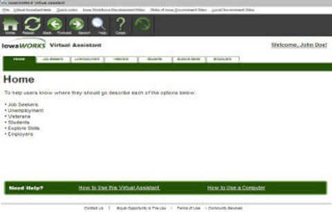
- The app only covered one fourth of the screen, decreasing visibility.
- The navigation architecture provided no breadcrumbs to assist users in knowing where they were within the app.
- There was no clear description within the information architecture to assist users in knowing what specific function(s) a specific section provided. Also, when users clicked a link within one of the major functions the app would send them to an outside link without the ability to go back. Users were forced to close the page and return to the app’s main screen each time thus reducing efficiency.
Kiosk Design
IowaWorks could also be accessed on specialized credit card style kiosks within certain locations throughout the state.
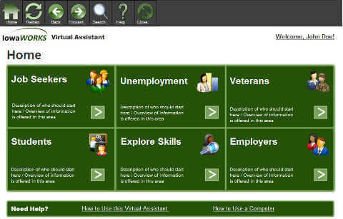
We designed a layout using grids. Each item within the grid provided information about a specific function just like the icons from the current app. The navigation was placed clearly at the top with breadcrumbs.
Each option on the home screen and all subsequent screens contained a description as to its specific function.
Job seekers also benefited from an initial passport feature where they could complete an initial form much like a social media profile page. The feature contained pertinent employment information that would automatically fill fields on applications once the user allowed permission.


